Imperfect by Design: The Beautiful Rebellion Against Perfect AI
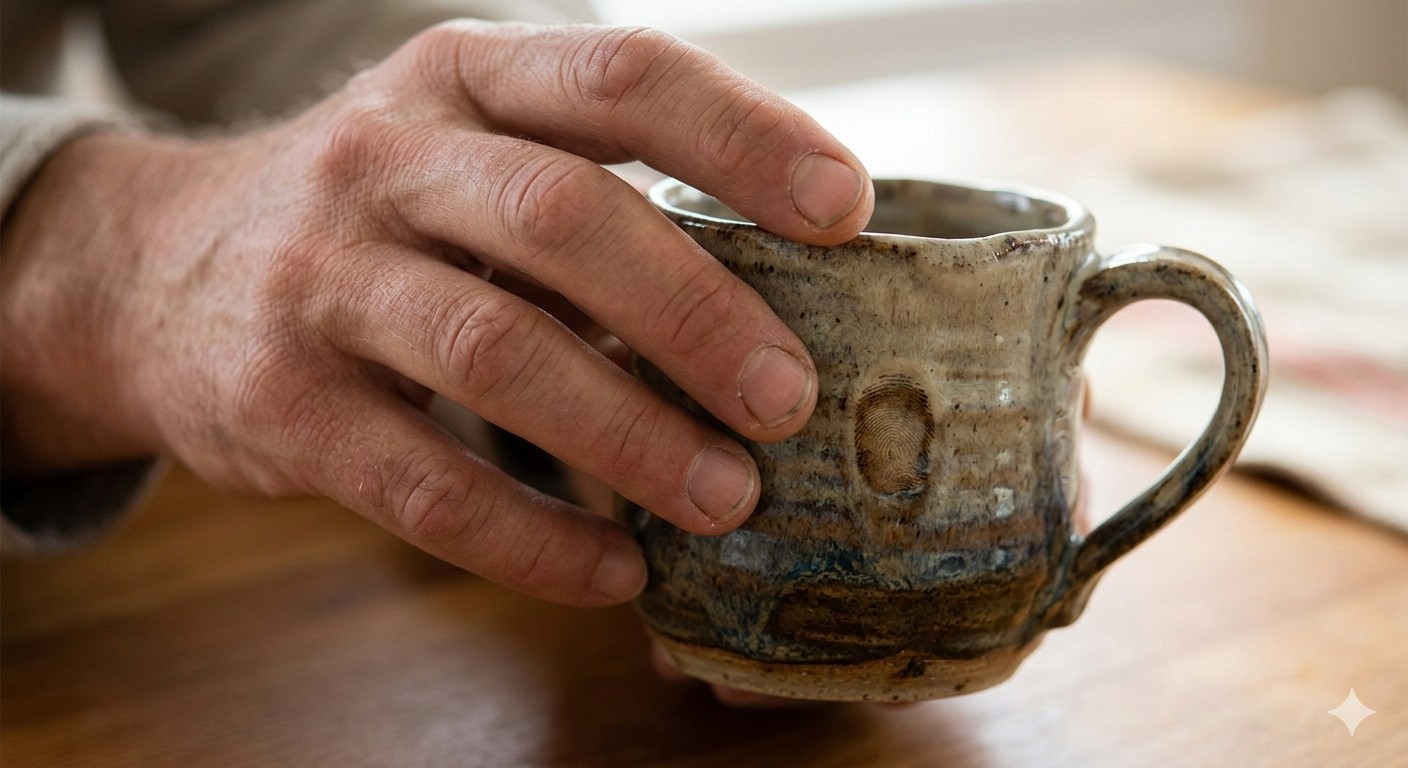
Run your fingers across the surface of a ceramic mug made by a human hand. Feel the slight irregularity where the rim turned. The glaze that pooled a little thicker at the base. The fingerprint pressed into the clay before it was fired. This is what meaning feels like. This is what 80% of the world’s creators said they wanted back in 2026, after years of AI-smooth, algorithm-polished, perfectly gradient-meshed content. They wanted the fingerprint.
The Vision: Imperfection as Intention
Canva’s 2026 Design Trends Report — drawn from the design behaviour of 260 million creators across one billion monthly designs — declared 2026 the Year of Imperfect by Design. The data behind this declaration is striking in its specificity: searches for lo-fi aesthetics surged 527%. Searches for “liminal” and “uncanny” content jumped 220%. DIY-inspired design elements rose 90%. Zine and Substack-style layouts climbed 85%. Brutalist design and type poster searches grew 77%. Across every data point, the signal is the same: creators are actively, deliberately rejecting the over-polished, over-processed, over-optimised aesthetic that has dominated digital design since AI tools became mainstream.
This is not a retreat from AI. It is a creative recalibration of how AI is used. As Canva’s Creative Director noted, the 2026 moment is about “getting permission to create without chasing perfection.” 77% of creators surveyed describe AI as an essential partner in their workflow — but 80% say this is the year they reclaim creative control. The creative rebellion of 2026 is not against the tools. It is against the homogenised output those tools produce when no human fingerprint is applied to them.
The Technique: Three Steps to Intentional Imperfection
Step 1: The Grain Layer — Your First Act of Rebellion
Every AI-generated image has a tell: an over-smoothed, weightless quality that no physical camera ever produces. The grain layer is the fastest way to restore photographic authenticity. In Adobe Photoshop, after finalising your AI-generated composition, add a Filter → Camera Raw Filter layer and apply: Grain Amount 18–25, Size 28–35, Roughness 45–55. Set the layer blend mode to Luminosity to prevent colour shifts. For a more analogue feel, use a real film grain overlay from RNI Films or VSCO presets at 35–50% opacity over your AI output. The difference between AI-smooth and grain-treated is perceptible in 0.3 seconds — the time it takes a viewer’s eye to decide whether an image feels alive or fabricated.
Step 2: Introduce the Happy Accident
In pre-digital photography, the most memorable frames were often the unplanned ones: the light leak, the double exposure, the subject caught mid-blink in a way that revealed something true. Imperfect by Design practice deliberately introduces these elements into AI work. Techniques: add a subtle double-exposure blend of your AI image with an analogue texture scan (paper, concrete, linen, hand-press ink) using Multiply blend mode at 15–25%. Create a “glitch layer” using Photoshop’s Displace filter with a displacement map of 4–8px horizontal shift — applied selectively to edges rather than the full frame. Use hand-drawn annotations (a circled detail, a handwritten note, an arrow that feels physically added) to anchor the AI image in a human editorial context. These elements are not mistakes. They are the fingerprints that make the image yours.
Step 3: The Notes App Chic Framework for Social Content
Canva’s Notes App Chic trend — characterised by handwritten elements, raw screenshot aesthetics, and undone composition — translates directly into a social content framework for AU brands. Build your content in three layers: the AI-generated base image (using Canva Magic Studio, Firefly, or Midjourney); the human annotation layer (handwritten text in your brand’s voice, drawn in Procreate or Canva’s handwriting tools); and the texture layer (paper grain, ink bleed, or light-leak overlay). The deliberate “unfinished” quality of this aesthetic is not a limitation. It is the signal. In an ocean of AI-smooth, pixel-perfect content, the rough edge is what stops the scroll.
Standard AI vs. Human-Refined Imperfect Design
The Soul Check: Is the Imperfection Earned?
There is a version of this trend that is itself a form of AI polish: the perfectly engineered imperfection, the algorithmically optimised grain, the creatively calculated “happy accident.” This version is recognisable and hollow. Earned imperfection comes from a human who has something specific they are trying to say, and who introduces texture and rawness in the service of that saying. Before you add the grain layer, ask: what truth does this image need to convey? What feeling should the rough edge amplify? The technique only has soul if the intention preceded it.
Build a personal texture library from physical scans: crumpled kraft paper, concrete, weathered timber, linen, hand-press ink on watercolour paper. Scan at 1200dpi on a flatbed scanner. These textures are uniquely yours — not available in any AI training dataset, not reproducible by any generation model. When applied as overlays to your AI-generated work, they carry your specific physical world into the digital image. This is the 2026 definition of a human signature on AI output: not a watermark, but a material. Blend modes to experiment with: Multiply (adds weight and darkness), Overlay (adds contrast and presence), Soft Light (subtle texture, preserves luminosity).